

CREATIVE COORDINATOR
Coordinated the whole branding project:
Visual identity design and support brand collaterals.
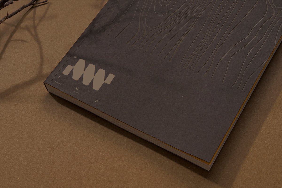
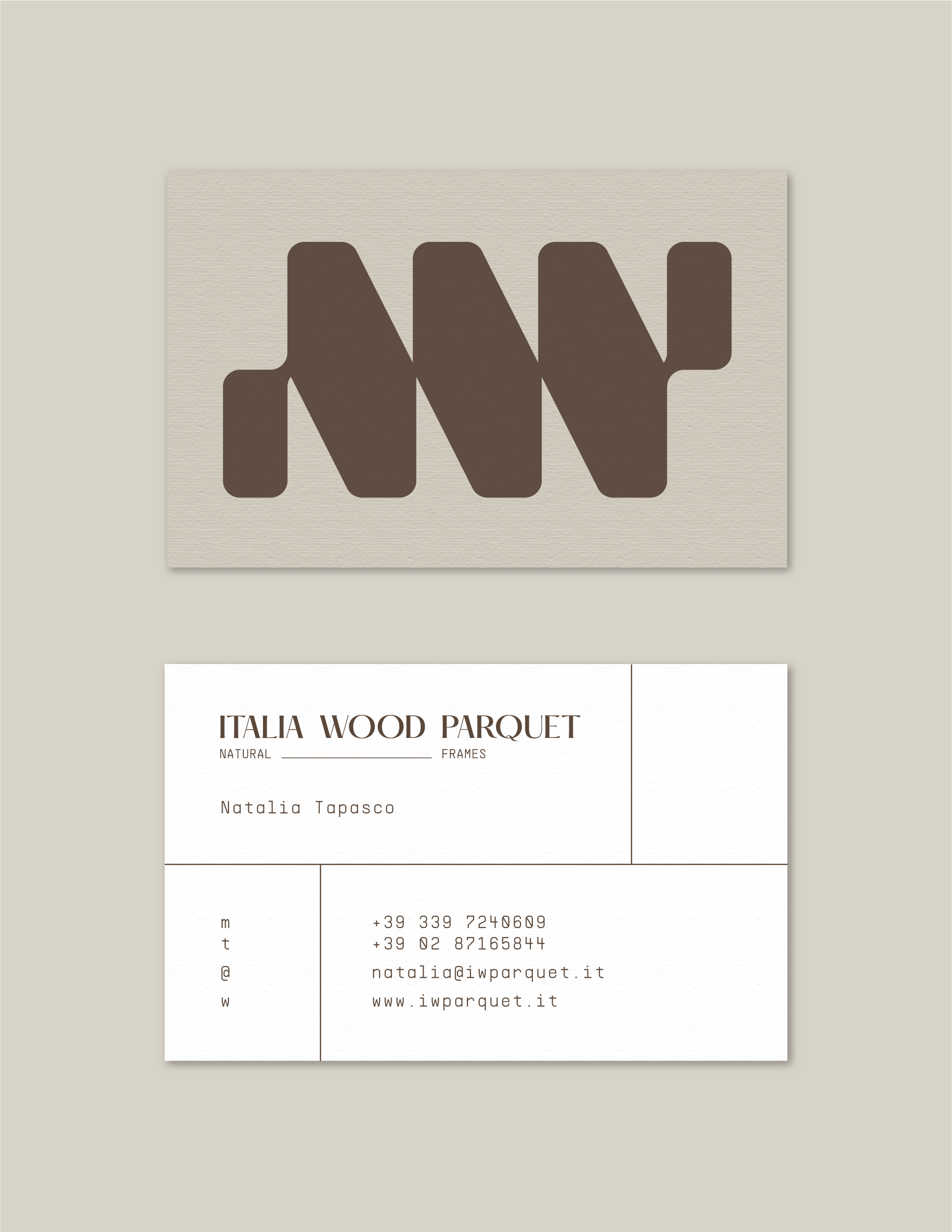
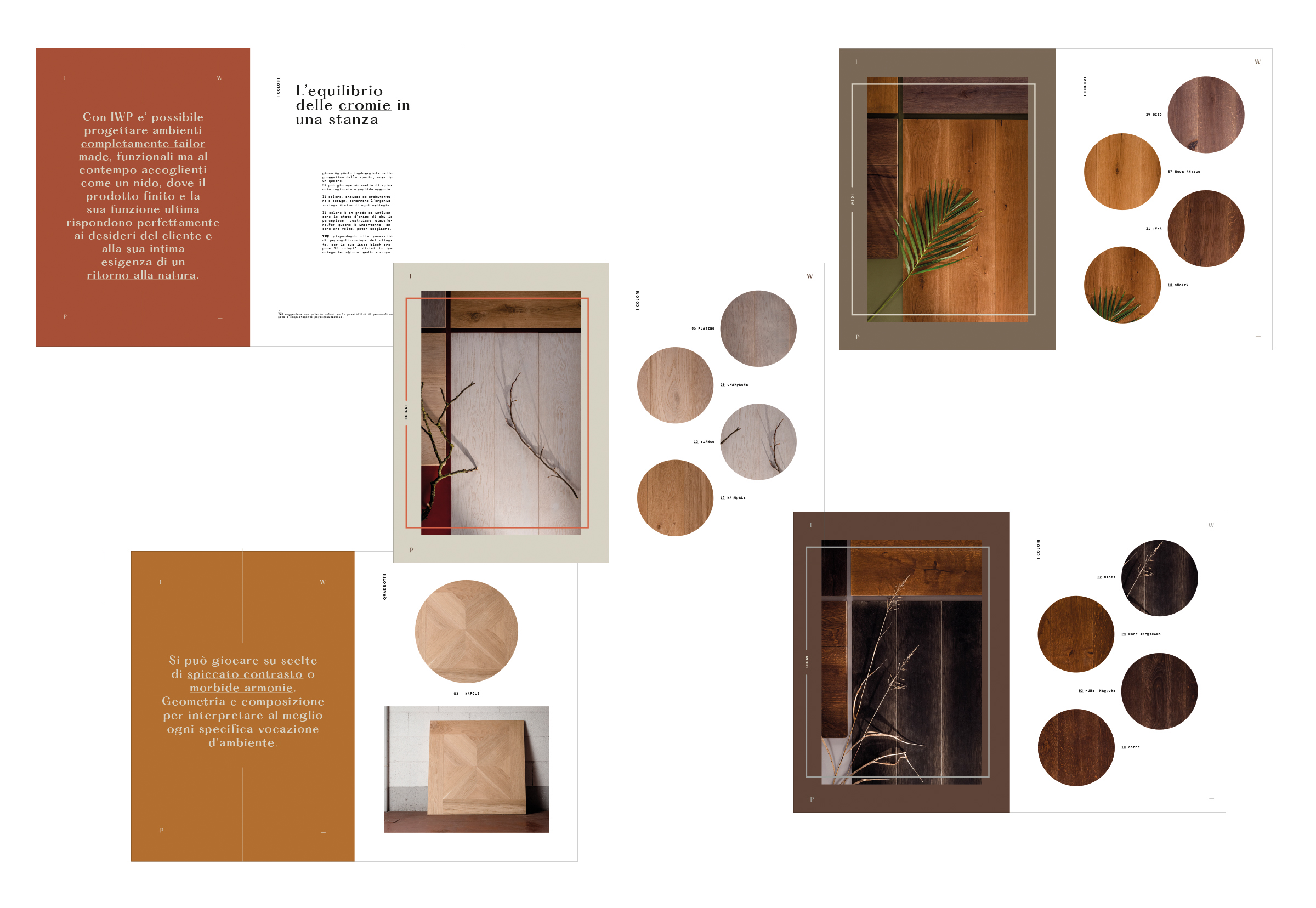
The pictogram, based on the nesting concept, is a graphic composition of geometric elements with rounded corners that reconstructs the IWP monogram. In contrast to the full volume of the pictogram, a visually lighter, elegant and modern font (Hatton) was chosen. The same modernity and contrast can be found in the monospaced font (Supply) of the pay-off. Note the game of slippage of the words to emulate what normally happens with the laying of the matrix elements that make up a parquet floor. The color palette refers to typical wood colors which, in combination with the logo, acts as an industry signifier.
